Bad website design mistakes, the phrase seems familiar, right?
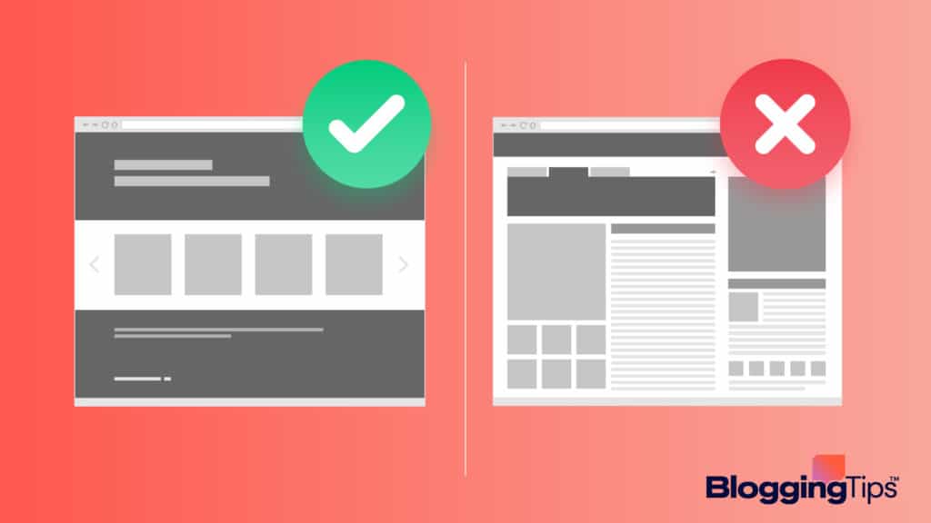
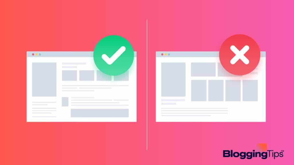
No one is perfect, and that includes website designers.
However, some mistakes should be avoided at all costs, because they can make your website look bad and may even drive visitors away.
In this blog post, we’ll take a look at some of the most common design mistakes and explain why you should avoid them.
Stay tuned for more tips on creating an effective website!
- 14 Website Design Mistakes That Should Be Avoided At All Costs
- 1. Poor Layout And Organization
- 2. Cluttered Or Busy Design
- 3. Ineffective Use Of Color
- 4. Wrong Fonts And Font Sizes
- 5. Using Too Small Or Too Large Images
- 6. Using Stock Photos Instead Of Your Images
- 7. Poor Website Navigation
- 8. Lack of Visual Appeal
- 9. Unclear or Incorrect Contact Information
- 10. Inaccessible Website Content
- 11. Slow Loading Times
- 12. Not Enough Whitespace
- 13. Not Optimizing For Mobile
- 14. Inconsistent Design
- 8 Examples of Cringe-Worthy Web Design
- Wrapping Up
14 Website Design Mistakes That Should Be Avoided At All Costs
There are so many mistakes that web developers do.
Below is the list of top 14 common web design mistakes that you should avoid at all costs for the success of your career.
1. Poor Layout And Organization
Website design is not always about how a website looks.
Many times it has more to do with how a website is organized and the user’s experience while navigating the site.
A well-designed website will take into account the user’s needs and make sure the information they are looking for is easy to find.
A poorly designed website, on the other hand, can be incredibly frustrating to use.
One of the most common errors made in website design is poor layout and organization.
This can make a website seem cluttered and confusing, and it can be very difficult to find the information you are looking for.
This often happens when a website tries to cram too much information onto one page, or when there is no logical order to the way the information is presented.
If you are designing a website, be sure to take care of the layout and organization, as it can have a big impact on the user’s experience.
2. Cluttered Or Busy Design
Website visitors are often turned off by cluttered or busy designs.
This is a common mistake that many website owners make, thinking that more information and links will keep people on their site longer.
You should develop a responsive web design.
However, this is rarely the case.
Too much information can be overwhelming, and people will quickly lose interest and leave.
The same is true of busy backgrounds and overly-complicated designs. Instead of trying to cram everything onto one page, it’s better to focus on simplicity.
Stick to a clean layout with plenty of white space, and use images and videos sparingly.
This will help to create a calm and inviting atmosphere that’s more likely to keep people engaged.
3. Ineffective Use Of Color
Website designers sometimes make the mistake of using too much color, or colors that clash.
This can make a website look busy, and messy, and can be jarring to visitors.
Instead, it is important to use color effectively, to create a pleasing and cohesive design.
A good rule of thumb is to use a maximum of three colors and to make sure that they complement each other.
Using a color wheel can help choose colors that work well together.
In addition, it is important to use light colors for the background and dark colors for the text, to ensure that the text is easy to read.
By using color effectively, website designers can create pleasing designs that are easy on the eyes.
Using too many graphics is also among the same mistakes.
4. Wrong Fonts And Font Sizes
Website design mistakes can come in all shapes and sizes – quite literally.
One of the most common (and easiest to avoid) blunders is using the wrong fonts or font sizes.
It might not seem like a big deal, but using an inappropriate font can have a major impact on the overall look and feel of your site.
Worse yet, it can make your site difficult to read.
So, what’s the best way to choose fonts for your website?
First, take into account the overall tone of your site.
Are you going for a fun and friendly vibe, or a more serious and professional one?
The font you choose should match this tone.
Second, consider the size of your text.
If you’re using large blocks of text, you’ll want to choose a font that’s easy to read.
Finally, make sure the fonts you select are compatible with all major browsers.
By following these simple tips, you can avoid making a major design mistake.
Use a font that makes sense and inspires interaction.
Because the first impression is lasting.
Useful reading: 7+ Free Tools to Help You Increase Website Traffic Exponentially
5. Using Too Small Or Too Large Images
Website design is essential for any business that wants to have an online presence.
In digital marketing, to create a website that is both visually appealing and easy to use, designers must carefully select each element, from the layout to the fonts and colors.
One common mistake is using images that are either too small or too large.
Small images can appear blurry or pixelated, while large images can take up too much space and make a website seem overcrowded.
Using too small or too large image is one of the bad website design mistakes.
The ideal solution is to find a balance by using a mix of medium and large images.
Additionally, designers should make sure that all images are optimized for both desktop and mobile devices.
By taking these considerations into account, website owners can ensure that their site will be attractive and user-friendly.
Remember, images are an eye-catching focal point for your blog and should be optimized through search engines.
Also read: How To Monetize A Blog In 2022
6. Using Stock Photos Instead Of Your Images
One common bad website design mistake is using stock photos instead of original images.
While it may seem like a good idea to save time and money by using pre-made images, doing so can harm your site in several ways.
First, stock photos are often of poor quality, which can give visitors the impression that your site is cheaply made.
Second, using the same photos as everyone else makes your site look unoriginal and unprofessional.
Finally, many stock photos are simply too generic to be effective, meaning they won’t add anything meaningful to your site.
If you want your site to look its best, make sure to use only original, high-quality images.
Also, avoid pixelated images or dancing images and too much text on the image also is a mistake.
Boring design and too much text become a bit confusing in marketing-related posts.
Poor navigation is one of the bad website design mistakes.
You want to create a site that is visually appealing and easy to navigate, but you also don’t want to make it so simple that it looks like you’re not offering much content.
Navigation refers to how users move around your site.
If it is confusing or difficult to use, then visitors are likely to give up and go elsewhere.
There are a few key things to keep in mind when designing your website’s navigation.
- First, make sure that all of your pages are accessible from the home page.
- Second, use clear and concise labels for each page.
- And finally, use consistent formatting throughout the site.
By following these simple tips, you can ensure that your website’s navigation is both effective and user-friendly.
Most related: Best WordPress Hosting
8. Lack of Visual Appeal
Website design is critical to the success of any online business.
Not only does your website need to be functional and easy to navigate, but it also needs to have a visual appeal that will attract and engage visitors.
One common mistake that businesses make is neglecting the visual appeal of their website.
A website that is poorly designed, with outdated or amateurish graphics, can give visitors the impression that your business is not professional or credible.
This can lead them to click away from your site without even considering your products or services.
On the other hand, a well-designed website can make a lasting impression on visitors and encourage them to explore your business further.
When it comes to website design, don’t underestimate the power of visuals.
9. Unclear or Incorrect Contact Information
One of the bad Website design mistakes is using the unclear or incorrect contact information.
When visitors to your site can’t easily find your contact information, or when they see outdated information, it reflects poorly on your business.
Worse, it can lead to lost sales and customers.
Make sure that your contact information is prominently displayed on your website, and that it is accurate and up-to-date.
Taking these simple steps will help you avoid this costly website design mistake.
10. Inaccessible Website Content
Website inaccessible content is one of the many design mistakes that can cost you dearly.
Web users are impatient, and if they can’t find what they’re looking for quickly, they’ll move on to another site.
So it’s important to ensure that all of your website content is easy to find and easy to understand.
One way to do this is to use clear and concise headlines and subheadings.
That way, users will know immediately what each page is about and be able to navigate to the section they’re interested in.
Another way to make your content accessible is to use bullet points and lists.
This makes it easier for users to scan the page and find the information they’re looking for.
Finally, be sure to proofread your content carefully.
Typos and grammatical errors can make it difficult for users to understand what you’re trying to say, so take the time to edit your work before publishing it.
By following these simple tips, you can help ensure that your website content is accessible and easy to find.
11. Slow Loading Times
One of the most common and frustrating mistakes is a slow loading time.
In today’s fast-paced world, people are used to getting the information they need quickly and easily.
If a website takes too long to load, users are likely to click away in frustration.
Several factors can contribute to slow loading times.
One is large images. Images are an important part of any website, but they need to be optimized for the web.
This means reducing their file size so that they load quickly.
Another common cause of slow loading times is poorly coded scripts and stylesheets.
Scripts and stylesheets can help to make a website more dynamic and interactive, but if they are not properly coded, they can slow down the loading process.
Finally, insufficient bandwidth can also be a problem.
If a website is receiving a lot of traffic, it may simply be overwhelmed by the amount of data that needs to be transferred.
These are just a few of the potential causes of slow loading times.
By identifying and addressing these issues, you can help ensure that your website loads quickly and efficiently.
12. Not Enough Whitespace
Whitespace is important in design for two reasons: it makes your content easier to read, and it makes your website more visually appealing.
Without enough whitespace, your website will look cluttered and busy.
13. Not Optimizing For Mobile
More and more people are using their mobile devices to browse the web, so it’s important to make sure your website is optimized for these users.
This means having a responsive design that adjusts to different screen sizes, as well as making sure your content is easy to read on a smaller screen.
14. Inconsistent Design
Your website should have a consistent design throughout, with similar fonts, colors, and layouts used on all pages.
This will help create a cohesive look that is easy for visitors to navigate.
8 Examples of Cringe-Worthy Web Design
While we have a lot of blog posts filled with tips on how you can make stellar-looking blogs and websites, in this article we will take a slightly different approach to educate you.
Here, we will look at 8 examples of astonishingly bad websites, discuss where they went wrong, and learn from their mistakes.

1. Suzanne Collins Books
Do you like The Hunger Games series?
We certainly do.
Given the popularity of Suzanne Collins’ franchise, you would think that she would invest in having a more professional online presence by hiring a professional development firm.
Maybe she thinks she has nothing to prove anymore?
We can only speculate.
What we know for sure though is that this website’s overuse of white space, odd center-floated photograph at the top of the page and a right-justified menu all conspire together among many other things to make this bad website one to forget.
2. Yale School of Art
Yale is one of the most prestigious schools in the country boasting ultra-low acceptance rates and prestigious alumni.
If any of those prestigious alumni are web developers, they might want to donate their services to the school’s art wing.
Immediately when you go to the page you see a bright yellow tiled background that jars users rather than welcoming them in.
Then, to contrast the bright background, we get grey boxes with erratically formatted text that make you feel like you’re on a scam site rather than on the Yale page you were searching for.
Rest assured this is a real Yale website.
3. Waking People up With Truth
We get it. Conspiracy websites aren’t supposed to be good.
They’re supposed to be as nutty as their creators.
Why is that though!?
You’d think that if a conspiracy theorist were trying to get somebody to buy into what they’re saying, they’d want to present it a little more credibly.
Maybe conventional taste in design is a conspiracy this website is trying to bust…
Whether or not that’s true, all our small minds can do is jump to the conclusion that from its bad background to its website description you need a magnifying glass to read at the top of the page, Waking People up With Truth is definitely among the top bad websites.
4. Head Hunter Hair Styling
We’ll admit, this website is not all that bad. It has a nice full-screen video in its banner position, a clear menu at the top of the page… it definitely checks some boxes.
The reason why we’ve flagged it among our bad websites is because of its simple yet important miss on color.
The use of blue at the top of the page invokes feelings not of style but of something more generic or unrelated like a beach.
This website would benefit big time by recoloring its menu section with something darker.
That darker palette would make the site feel more sophisticated and on-brand with a hair styling organization.
5. Electrifying Times
Electrifying times is a website that’s supposed to be all about the latest and greatest in electric cars.
Unfortunately, it looks like a website from the early 2000s advertising a local carnival.
Not only is the site non-responsive, it also uses animations to draw people’s attention to new articles and ultimately does ZERO to inspire confidence in consumers that this is a credible source when it comes to electric vehicles.
6. Irish Wrecks Online
Have you ever wanted to find a website dedicated to telling you about Irish shipwrecks?
We didn’t think so.
As it turns out, the more niche your topic of interest is, the worst the websites you find providing the information you need get.
While this site almost qualifies as a passable minimalist motif, it loses the chance of being acceptable thanks to its textured background and the fact that you have to click on a picture of a ship to enter the actual site.
Only bad websites make you solve puzzles to access their contents.
7. ARNGREN.net
Here’s a bad website for the history books. Never have we seen a site overwhelm users with TMI more than this site does.
Explaining where this site went wrong seems pointless.
Just navigate to it and prepare to go cross-eyed.
8. Internet Archaeology
This is one of the only bad websites that have given us nightmares.
We’re thinking that the site’s intent is to be unwelcoming, confusing, and then (if you dare enter the purple door) unbearable.
Still, whether its intent was to be bad or not, there’s no denying that the site’s alienating use of animation does more to scare users away than it does to welcome anybody in.
Wrapping Up
In conclusion, web design mistakes can cost you dearly in terms of lost sales and customers.
By taking the time to avoid these mistakes, you can help ensure that your website is successful.
We hope you will overcome the web design mistakes and grow steadily.


