Typically, when you think of what makes up a strong website design, it’s primarily having your site be user friendly, have a purpose, cater to your target audience, frequent imagery and content, and use search engine optimization (SEO).
However, a contact page would be another essential element of having a solid website.
So how do you create a contact page, and why is it vital for your website?
Here, we will go over the basics of creating your contact page and some examples for inspiration of what it should look like and its features.
What Is a “Contact Us” Page?
A “contact us” page is the last page on your website after the visitor accesses all of the other pages.
This page is like the epilogue of your website.
It allows visitors to engage by contacting you, the website owner, or a specific department, such as the sales or support team.
How Does a Contact Page Work?
A “contact us” page entails a couple of emails or phone numbers to contact you or a sales or support team member.
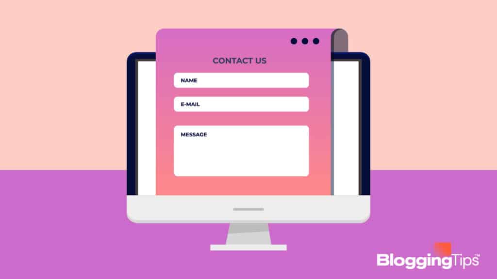
Sometimes, websites will include a contact form in place, which would allow the visitors to fill out a message form that will be sent to you or the website representatives.
To have a functional contact page, it has to be organized so that the information is easy to find.
Do I Need a Contact Page?
It’s crucial for your website to have a contact page.
Without it, it will prevent visitor engagement with your content and overall have the ability to communicate with you.
If they are interested in your content, it’s important to have a form of contact if they have any comments, concerns, or questions they want to ask.
Why You Need a Contact Page
Either for your blog or website, having a contact page helps provide one method of visitors getting in touch with you.
Also, it can also lead to potential clients or customers, further boosting the attention your website receives.
The typical contact forms would be phone numbers, the establishment’s address, and social media.
1. Active Engagement with Target Audience
This is one of the advantages of having a contact page.
Visitors on your website or blog will most likely be curious about engaging more in your content.
For instance, if your website or blog is for your store, and a potential customer is interested in one of your products, they can inquire more about it by going to your contact page.
2. Accessible communication
This is a top priority for a user-friendly website or blog.
The information that the visitor is seeking must be easy to find and read.
A contact page will organize all of the available information for communication in one place.
Making your contact information easily accessible and convenient to find will further increase the level of visitors that will contact you.
3. Obtain a Reputation of Being a Reliable Source.
When you not only have an efficient contact page but frequently respond to inquiries by visitors, you start to obtain a positive reputation.
This will boost engagement with your website and content as well.
Providing frequent assistance will grow your loyalty among regular and new visitors.
4. It won’t disrupt your user’s experience on your website.
Sometimes, websites will have a pop-up advertisement, giving visitors the option to access the business’ contact information.
However, this might not be the best option, and it can disrupt their experience.
By placing the contact information on its own page, you lessen the risk of having the visitor disengaging from your site.
5. Structured Analytics
This will give you complete control in tracking the visitor’s engagement with your website or blog’s contact page.
Using your analytics tool will help you keep track of your visitors and determine what you need to do in the future if they do not reach out and communicate with you.
Contact Page Best Practices
It is critical to consider what will make up your website’s contact page.
Below are the best practices to consider when creating your contact page.
What is Considered Contact Information?
The factors that make up the contact information on your page should be an email address and a contact form in case your visitors have any queries.
Factors that are also considered contact information would be having a business address, phone number, or particular employee and department contact information.
How to Structure a Contact Page
When you’re formatting your contact page, you have to make sure that the structure is easily accessible and to use.
To structure a contact page properly, include the following:
1. The Contact Form
This is one of the main components of a contact page.
Before you create your contact form, it’s crucial to figure out where you will place it.
It is recommended to put it on the top as it will be the first thing the visitor sees on the web page.
This will give the visitors a chance to message you immediately instead of having to scroll down to find it.
2. An Email Address
This is another vital factor to include on your contact page.
Typically both an email address and a contact form function similarly.
However, having an email allows more options for the visitor to message you or the department directly.
This way, they can have a copy of the message in their email if they receive a response.
3. A Phone Number
It is also considered crucial in having instant contact services.
This allows a more one-on-one contact between you or the department and the visitor who is calling.
Having a phone number on your contact page allows the visitor instant communication.
4. Listing Your Social Media
It will broaden your online exposure and help increase your visitor engagement on your website or blog and your other accounts.
Though, social media links aren’t as critically important as the previously stated factors.
So, you can list your social media below the most important contact information.
5. Specifications on Your Contact Page
It will allow the visitor to access the information quickly.
For instance, if more than one person operates the website or there are specific departments, be sure to specify what department they work in so it is easier for the visitor to distinguish.
How Should a Contact Page Look?
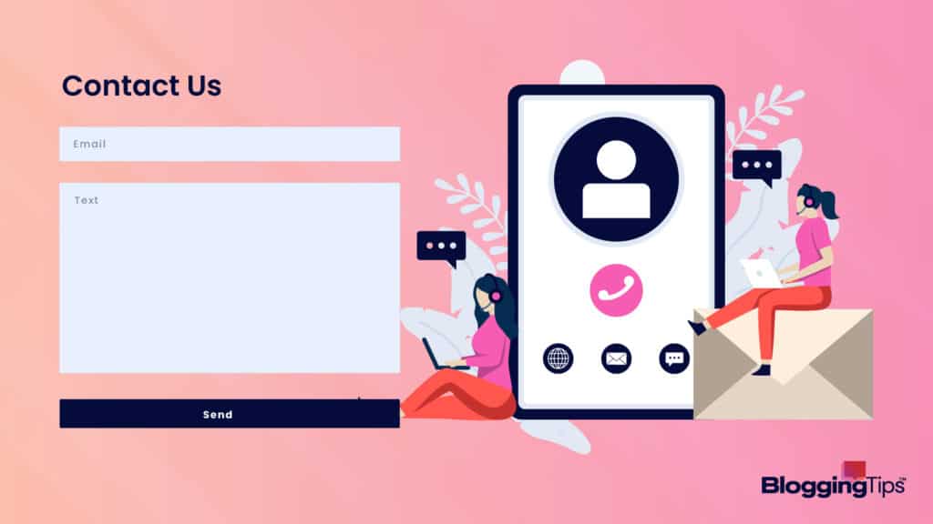
Ideally, your contact page should be structured from the most crucial information to the least.
The first information set should be your standard email, phone number, physical address, etc.
If there is more than one department other than yourself to contact, organize the information by importance.
What Should NOT be Included on a Contact Page?
You must remove unnecessary details that no longer pertain to the subject.
Do not put any personal information such as your phone number, home address, and email on the contact page.
Do not focus on information that is unrelated to your website or blog.
What Makes a “Contact Us” Page Stand Out?
A contact page usually stands out due to its organization and functionality.
The purpose is to make it accessible for visitors, so information must be easy to find.
The information must be organized efficiently, causing the visitor to engage easily.
How To Make Your ‘Contact Form’ Easy To Use
As any web developer knows, the contact page of a website is one of the most important elements of the site.
After all, if a visitor can’t easily contact you, they’re likely to go elsewhere.
There are a few key things you can do to make sure your contact form is easy to use.
1. Make The Form Short And To The Point
The first thing you want to do is make sure the form is short and to the point.
There’s no need to include a lot of fields that aren’t necessary.
Just include the basics, such as the visitor’s name, email address, and message.
Contact forms are usually pretty short, so there’s no need to include a lot of unnecessary fields.
Just stick to the basics, such as the visitor’s name, email address, and message.
You can find contact us page examples here.
2. Use Clear And Concise Labels
The labels on your form fields should be clear and concise.
This will help visitors understand what information they need to provide.
In addition, you may want to consider using placeholder text to further explain what information is needed in each field.
3. Include Clear Instructions On How To Fill Out
Be sure to include clear instructions on how to fill out the form.
This will help visitors understand what they need to do and make it easy for them to complete the process.
4. Use A Friendly And Helpful Tone
The language you use on your contact page should be friendly and helpful.
This will make it more likely that visitors will reach out to you with their questions or concerns.
5. Make Sure To Have A Good System In Place For Responding Queries
It’s important to have a good system in place for responding to queries.
This could include an auto-responder that sends a confirmation message once the form has been submitted.
In addition, you should make sure to respond to messagespromptlyr.
By following these tips, you can be sure that your contact form is easy to use and that visitors will be able to get in touch with you with ease.
Contact Us Pages: Top 10 Examples
1. Brandaffair
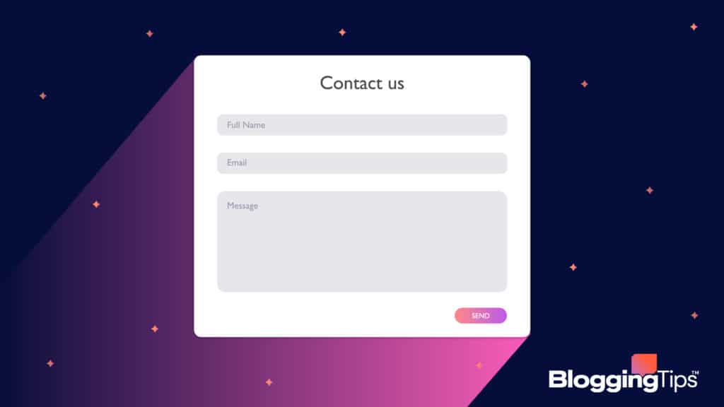
Brandaffair’s “Contact Us” promotes an instant contact service by communicating with them directly rather than contacting a secondary source.
It displays a map and their address on where to visit them, its “Meet Us” establishes a phone number and email, and the “Pitch Us” section offers the visitor a form to message the company directly.
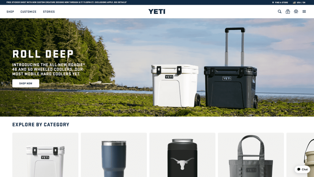
2. Yeti
Yeti specializes in gear and drinkware for the outdoors.
Sections organize its “contact us” page at the top.
It features the three contact forms at the bottom: customer service, corporate office, and corporate sales team.
This stands out because it balances the imagery of the woodsy background and the white one to make the contact information visible to the visitor.
3. Morroni
Typically, most visitors are thrown off by the contact form for their “contact us” page.
However, by utilizing vibrant colors and humor, they include their contact information at the very top while also placing the contact form at the bottom.
It adds a fun, creative take on a usually professional section of the website or blog.
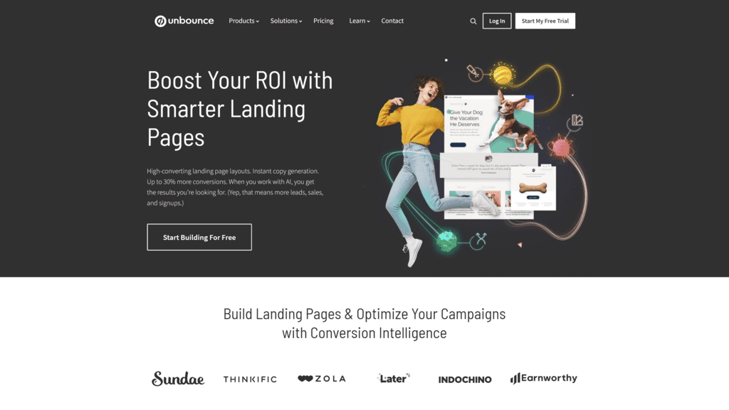
4. Unbounce
Their “contact us” page is basic yet informative, placing the section’s header in the center.
It organizes its contact information and inquiries in one place, making it easier to access.
Their information doesn’t clog the entire page as it’s organized into four sections.
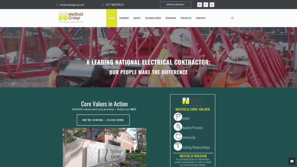
5. Weifield Group Contracting
Like Morroni, this company also provides the contact information on the top and the contact form on the bottom.
They do this by enlarging the font, and adding clickable CTA buttons and large form fields, making it easier for visitors to fill out.
This helps make the contact page user-friendly, desktop and mobile wise.
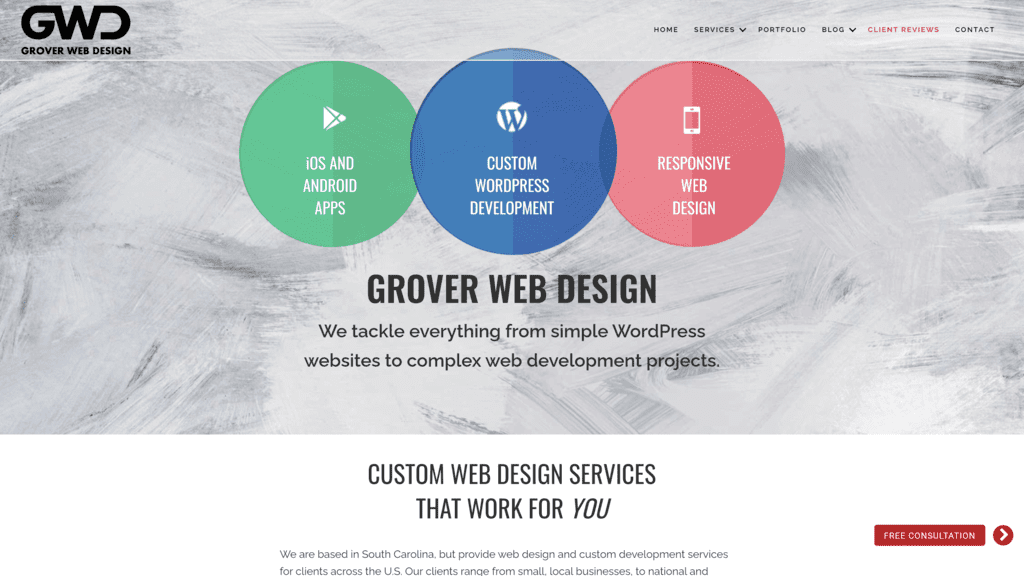
6. Grover Web Design
The design for their contact page is straightforward, as the contact form is right next to their contact information.
The font for the contact information is big, so if visitors are on mobile, they don’t have to pinch and zoom.
It also features CAPTCHA on its contact forms to prevent spam submissions.
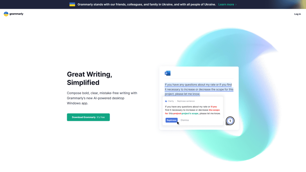
7. Grammarly
Their contact page is straight to the point, providing three CTA’s such as press, help & support, and sales.
The primary sources of contact information are bolded and highlighted, giving a small summary of what the sections represent.
8. Half Price Books
Their contact page is one of the sections for their services and support category.
Even though they clump this section with others, they all relate to the same factor.
They do provide a contact form and their hours and ways of contacting via email and phone number.
9. Zashadu
Zashadu’s contact page is ideal because it makes contact information readily available.
Using the contact page, located by the footer, the visitor can easily navigate through it.
This makes the process of finding the contact information faster.
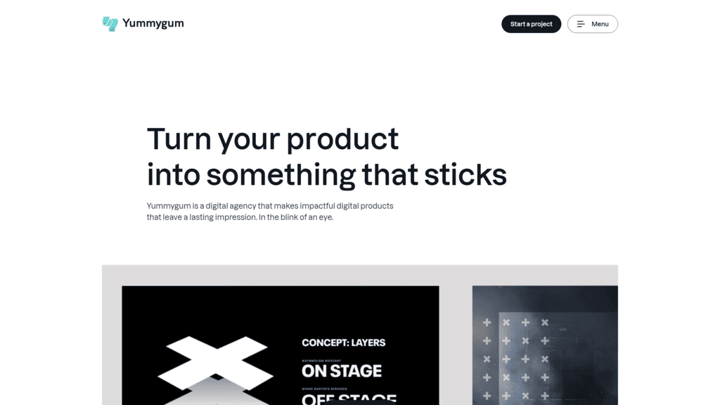
10. YummyGum
YummyGum provides a friendly and informative take on their contact page.
They also offer a two-step process when filling out the contact form.
Though, it is essential to use a professional tone rather than casual.
How to Create a Contact Us Page
How to Create a Contact Us Page on WordPress
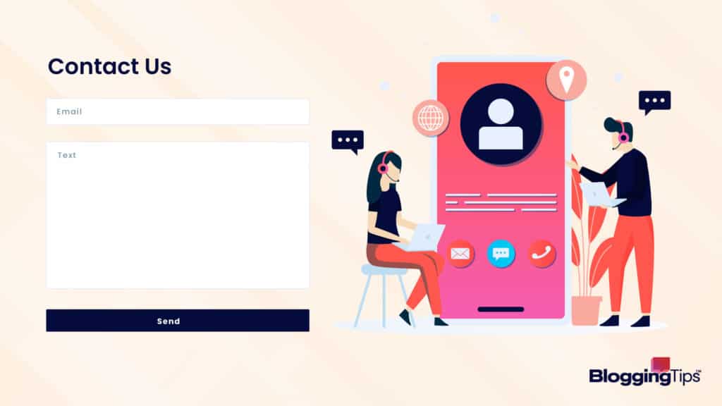
- You have to choose a WordPress contact form plugin.
- After you choose, install said WordPress plugin and activate it.
- Go to the All Forms page in your WordPress panel and add a new page.
- Customize and format your contact page.
How to Create a Contact Us Page on Shopify
- Go to your Shopify dashboard and click on the online store. It will bring you to your pages and from there, search for a contact or add new contact page.
- Give your contact page a title, then you can start adding information.
- Afterward, update your website navigation link by going to Online Store, click the main menu to change or add your Contact Us page.
How to Create a Contact Us Page on Wix
- Access the page you want to add the contact form to.
- Click add on the top bar and choose Add New page to website.
- Start customizing your contact us page.
How to Create a Contact Us Page Using HTML
- Choose an HTML editor, this will help you edit the website.
- Make a new file with the extension. PHP.
- Create PHP code to collect form data.
- Create and Customize Your Contact Form
What Can I Write Instead of “Contact Us”?
- Reach Us
- Talk to Us
- Connect with Us
- Get Ahold of Us
- Visit Us
Final Thoughts
When creating a contact page, it’s important to know how to format it and what information you’re going to share.
Make sure to keep your tone professional and informative.
We hope this guide helped you learn about contact pages and their importance.
